
branding
Cøeng
Rebranding, Website, Photography and Digital Marketing
The solidity of a company with 10 years.
About to complete its 10th anniversary, Coeng decided to renew its image, in order to affirm its solidity, credibility and notoriety.
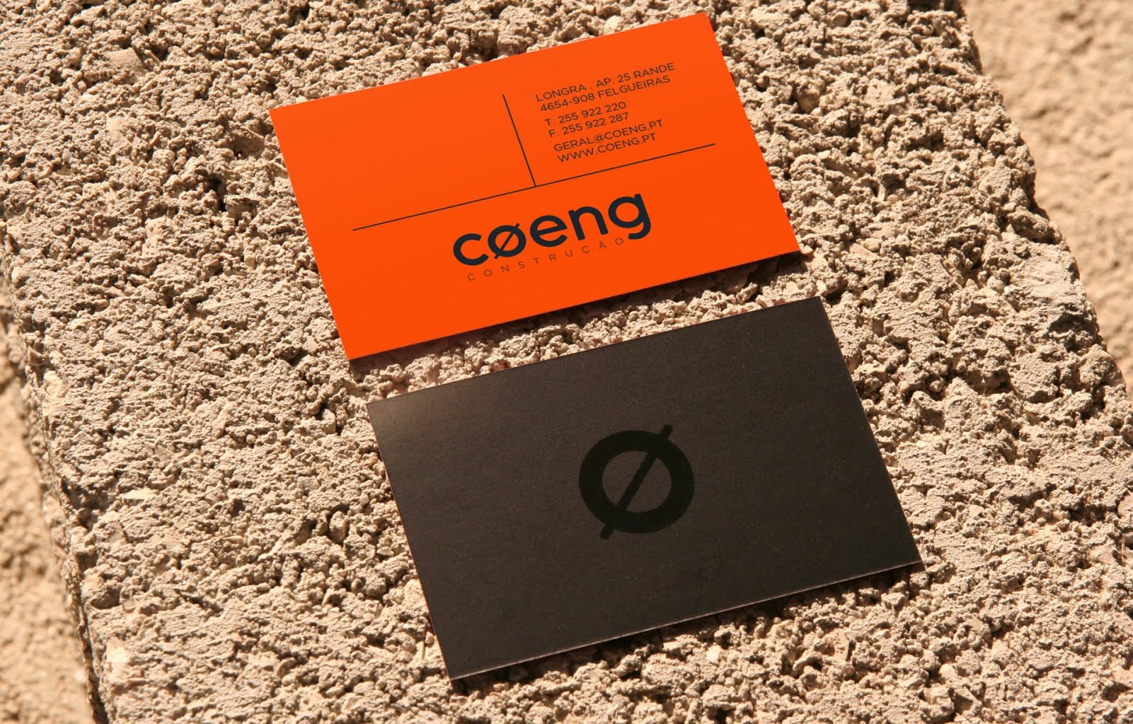
Duas Faces responded to the challenge through elements that represent the solid foundation of the brand, a specialist in the construction and rehabilitation markets: the symbol representing iron diameter, brick color and elegance black.
The project included redesign of the logo, creation of corporate identity, institutional communication, creation of responsive website (prepared for mobile platforms),stacionary, decoration of vehicles and office decoration. In this last point we highlight the placement of a concrete slab for the firm's office, with the new Coeng logo.
Client: Coeng Construção
Designer: Sérgio Duarte / Patrícia Machado
Web development: Joaquim Ribeiro
Production: Sérgio Duarte / Inuo Melo
Photography: Sérgio Ferreira
Print: Mania da Cor
Logo and responsive Website


marketing


Means:
In addition to the responsive website where the highlight is the portfolio of works carried out, the company renovated the entire department store and decorated the fleet of vehicles.
They entered the worlds of social networks with an account on facebook and instragram, with a great acceptance by the public.
